A mobile app icon is a small image that represents an application on a user’s device and in application stores. If you are about to develop your first mobile app icon design, these UX/UI tips will help you avoid disappointing and predictable roadblocks. Otherwise, you can hire a professional UX design agency to do it for you.
Users can quickly judge the professionalism of an app through the icon. Often users decide on an application exclusively by the appearance of the icon. A well-thought-out image is associated with a high-quality app and a user-friendly interface, which are always attractive for potential clients and users.
Why mobile app icons are important
The icon is the first thing that users see when they find the application in the Apple App Store and Google Play. When you make an icon professionally, it should attract users, not scare them away.

A well-made icon is what will help arouse interest and convince the user that the application is a useful and trustworthy investment. A poorly made icon does the inverse: it provokes confusion and promotes an idea of the uselessness of the application.
However, as soon as the user installs the application, the purpose of the icon changes. Now it helps find the app on the home screen, among other icons. So what can make the application icon stand out both in the store and on the user’s device? Let’s find out.
Tips for fantastic app icon design
Take into account the following tips for creating an amazing UX/UI icon design for an application:
1. Follow the guidelines
Icons do not exist by themselves. You should integrate them harmoniously into the instructions of the stores where you publish them, be it Google Play or App Store. They are an element of the store’s interface and shouldn’t look alien next to the icons of other applications.
The development of the application icon begins with an introduction to the manuals of the system manufacturer and grids study for building images in Photoshop. Both Android and iOS have their requirements for developers and designers to follow, and without knowing them, you can’t call yourself a professional.
Here is what you need to get started:
- Study the official website for Android application developers. Here you can read about the UX/UI recommendations like style, animation, components, patterns, layouts, and usability, as well as download suitable materials for designers.
- Apple’s iOS Human Interface guides come in handy if you want to create an icon for iPad or iPhone applications.
2. Know your audience
Market research must always come before the design for many reasons: you need to know how to attract your target audience, and to do that, you need to know their preferences, dislikes, and daily routines.
For example, the application icon for a local food delivery service will undoubtedly be different from the icon of an international period tracking app. In the latter case, you need to be sure that you use universal symbols that will be equally perceived by people from different parts of the world and will not offend anyone. If you look at some internationally famous products like Instagram or Tiktok, you will notice that they go with minimalistic designs and simple color schemes. This way, they can be sure they don’t create any ambiguities in users’ minds.
3. The right size
What looks good when it occupies an A4 sheet does not necessarily do so at 120 x 120 pixels. Professional icon design should take this into account. What already looks almost unrecognizable on your work screen for sure will be invisible on the user’s device.
4. Simplify the icon
Don’t try to add hundreds of extra small details to a tiny screen to make your message be understood. For example, it’s not a place to put portraits of a group of people. Remember the Sims? While the game is undoubtedly about playing for human characters, their icon is as simple as it can get.
5. Balance the light and the shadows
The two most popular operating systems have different requirements for developers. In Android, according to Google Icon design specification, you need to create icons without adding shadows, because the store will do it automatically.
In the case of iOS, after they have introduced the Dark mode, adding shades there has become unreasonable – they won’t be visible because of the black background anyway.
6. Check how the icon looks on the background of a different color
In the store, you can see the icon on a white or light gray background, but the wallpaper on users’ devices is much more diverse. Therefore, do not forget to check how the design of the application icon appears on light, dark, and contrast backgrounds.
7. Do not be afraid to use perspective
Of course, if this does not violate the overall impression. The first use of attitude will help you make the application icon even more visible. Designers use this trick in games, and it helps to convince the user that the app is going to be very engaging and adventurous. For example, look at the app icon of the Cannon Shot game with a cannon shooting balls in the distance.
8. Create an interesting form
Neither App Store, nor Google Play prohibits using exciting shapes for the icons. They can make an app stand out among the others, and users remembered them. They are also easily distinguishable on the client’s device. The shape helps to recognize the icon even if it is tiny. However, you also need to consider that crazy forms are not as adaptable as standard ones and can look weird on some screens.
9. Invest in the colorwork
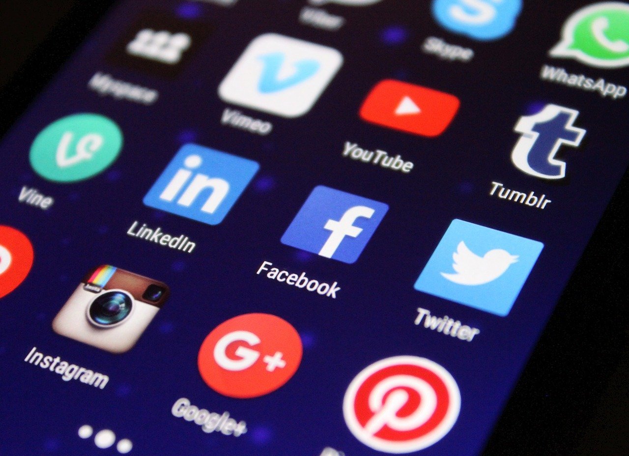
If you start to increase the number of colors used, it will be difficult for you to stop. Therefore, use one or two colors – this is enough. Remember, Facebook, Skype, or Twitter icons as good examples of two-color symbols.
Also, don’t forget that different colors convey different types of information about the brand in the minds of users. So use them accordingly.
Blue: trustworthy, smart, peaceful, stable.
Red: romantic, angry, immediate, passionate.
Green: ecology, natural, balance, rest.
Black: bold, rich, powerful, elegant.
Orange: young, attractive, happy, healthy.
10. Do not use photos
There are great photorealistic icons, but using pictures in application icon design is a taboo. Keep in mind that if you break the guidelines of the store, the application will not be published. However, you can convert a photo into a vector image. It can work well if you design a logo for a photo editor, for example.
11. Create application icons without extra text
Small text is challenging to read, and its use will create problems in the case of localization, for example, if a company releases the application for the Chinese market. At the same time, you can use the first one or two letters from the company name, as Tumblr or Linkedin do.
12. Do not use application interface elements on the icon
It is a terrible practice that confuses the user. As we already said, the icon is small. So, keep it simple and user-friendly.
13. Create icons that talk about the primary function of the application
With the right image, the user does not even have to look at the description. If it’s a mobile game, depict the main character, if it’s a photo editor – a camera or a lens, and for instant messengers like Viber – a message cloud. Use symbols to express the main idea of the app – this saves time for the user figuring out what kind of program they are looking at.
14. Learn competitor icons
Study your competitors. Most likely, they give hints about the main functionality of the application. Therefore, try not to repeat what they do. There are different ways to advertise your idea without plagiarizing the same notion. For example, while the majority of messengers on Google Play Store use a message cloud for their icons, the Telegram icon of a paper airplane looks original and conveys the same idea.
15. The icon should be recognizable
Following the official guidelines and trying to keep up with your competitors, might make you forget that your icon should be unique. It is your brand, and it must be recognizable from the first sight. Make sure that you consistently use it in other places, for example, websites or marketing campaigns. For instance, international clothing stores like H&M use their logo for the app icon instead of placing a dress or other clothing item there. Their name is the best advertisement for their app.
All in all
As you can see, you should pay close attention to even the smallest elements of UX/UI design. An excellent mobile application icon design helps attract new customers to your app. It is also the “face” of your product that your competitors will see in the app stores.


