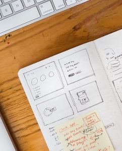
When it comes to eLearning, there is an increasing art to designing a tutoring platform that works for both students and tutors alike. Our content consumption is increasingly cross-platform by its nature. This means that tutoring sites need to offer a slick and consistent user experience and interface, regardless of what device or screen real estate a student is working with.

As with learning any new skill, it’s important for students to have their educational material presented in a clear and digestible manner too. As web design trends evolve and user behavior follows suit, let’s look at the key design trends for eLearning platforms that are having a positive impact on student engagement.
Visuals that simultaneously build trust and offer immersion
Well-placed imagery is important for eLearning platforms to help demonstrate integrity and build trust with prospective students. Tutoring site templates are increasingly incorporating sections for tutor profiles, where professional photography can help to humanize an educator. Preply has rapidly grown into one of the world’s leading online language learning platforms. Its online English tutor programs are particularly popular, but with competition fierce in this niche, they’ve opted to use tutor profiles and friendly imagery to provide total transparency and reassurance over the genuine nature of its services.
One of the easiest and most effective ways for web designers to encourage eLearners to engage directly with subject matter is to deliver sensory immersion through imagery. Visuals that students can almost feel and taste are a great way to appeal to an individual’s senses. For example, an online cookery course may look to use professional quality photos of ingredients or snapshots mid-cooking to try and provide a sense of what students can expect to find for themselves in the pan. Whether it’s flame-grilled, steamed, or grilled, culinary images can paint a thousand words and teach users to cook with their eyes, as well as their brains.
The return of ‘flat’ designs
In some cases, web design trends in eLearning are moving towards simplified user interfaces (UI). Flat web designs used to be the only option for designers before the ability to incorporate 3D elements using stylistic techniques such as gradients or shadowing. Despite more complex web designs being embraced in other sectors, eLearning platforms have continued to put their faith in flat design UI, which is streamlined and fast loading.
Many individuals that apply for distance learning courses with an online tutor study alongside another job or pursuit. They don’t often have the time to hang around waiting for pages and course material to load. Time-poor distance learning students benefit the most from flat design themes that focus squarely on typography and displaying on-page content in a clear, understandable way.
The minimalist nature of a tutoring platform with a flat web design means that these sites rely heavily on their color palettes rather than their interactive elements. The latest design trends in eLearning are for sites to feature bright and vibrant colors that are fully saturated. This is then contrasted with the use of black or dark grey text overlaid on the screen. The color palettes tend to complement one another through saturation or tone.
Fully responsive designs
According to Statista, the percentage of online traffic derived from mobile devices globally stood at 54.8% in Q1 2021. That’s up from less than a third (31.16%) in Q1 2015. With the majority of users now consuming content in all its various guises via smartphones and tablets, it’s little surprise that tutoring platforms have had to embrace the fully responsive digital world we live in.
We’ve already mentioned that many eLearners are time-poor and simply don’t have the time to dedicate hours on end to self-improvement. eLearning platforms that make it possible to digest valuable education material anytime, anywhere have proven invaluable for driving conversion rates with tutoring providers.
One of the biggest challenges for web designers to overcome when designing portals for eLearning courses is the concept of scrolling. Although a desktop version of an eLearning site can present content in landscape slideshow format, this is not so straightforward for a mobile-friendly theme. Instead, designers look to “stack” course elements like interactive media and imagery. This provides a story-like user journey, creating a sense of progression through course material or modules on any mobile screen, regardless of size. Infographics like the one below are also regularly used for responsive designs to articulate services in a bitesize form.


